


Reading time: 8 min.
In short:
The color of an object depends not only on its actual hue, but also on the light that illuminates it. The color rendering index (CRI) evaluates a light source's ability to faithfully reproduce these colors. A high CRI improves visual perception, comfort, and even mood. In this article, discover why you should pay attention to it, especially in your home.
📌 Summary
What is the color rendering index?
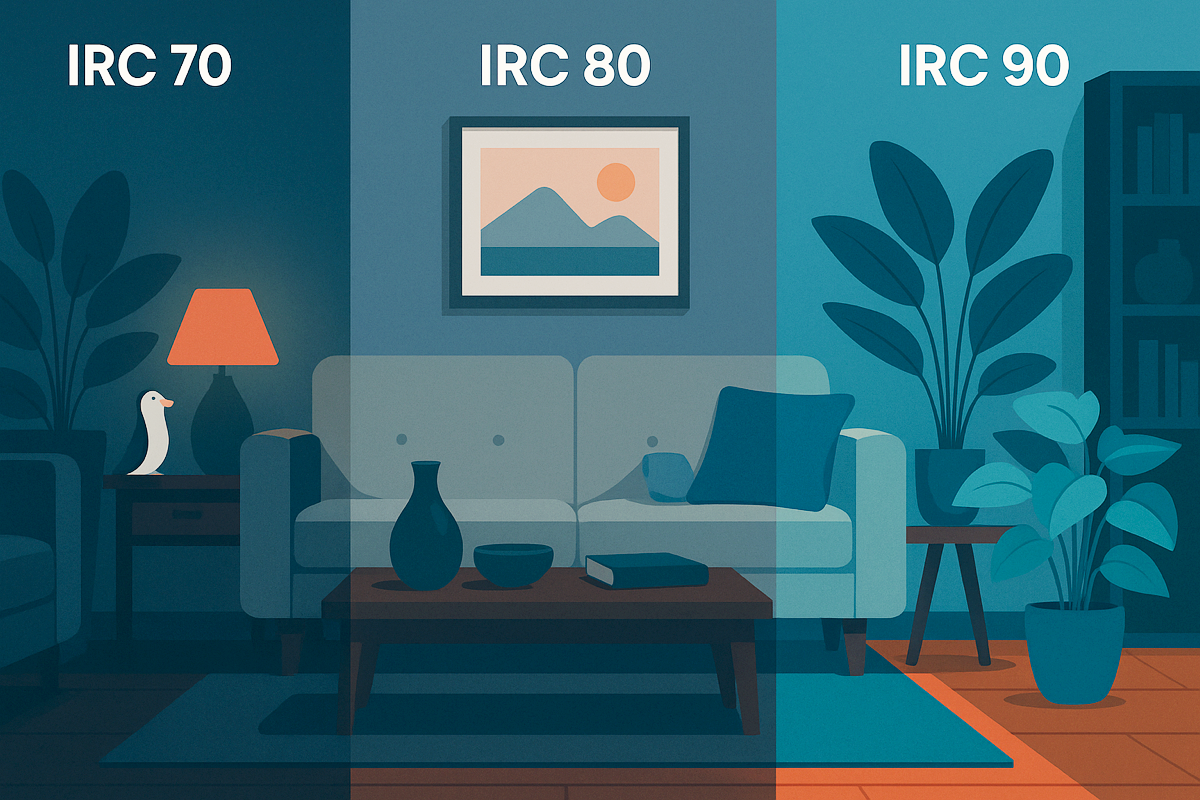
The Color Rendering Index (CRI) is a scale from 0 to 100. It measures a light source's ability to reproduce colors naturally. The closer the CRI is to 100, the more realistic the colors appear, similar to sunlight. A CRI of 80 is considered good, but from 90, the quality becomes significantly higher. This index does not measure the intensity or temperature of the light, but only the color fidelity. This is a criterion that is often overlooked... wrongly.
A poor CRI can make complexions appear dull, food unappealing, or interiors desaturated. In a room lit by a low CRI source, reds appear brownish, and greens become grayish. This affects perception, decor, and sometimes mood. In short: two bulbs of the same intensity can produce a radically different visual effect. And this is what the CRI helps us anticipate.
Why is it important at home?
At home, we don't just look at objects. We look at ourselves, we cook, we work, we read, we choose clothes. In all these actions, color accuracy influences our daily lives. Accurate light allows us to better appreciate the quality of a fabric, the freshness of food, or even our skin tone in the mirror. In the kitchen and bathroom in particular, a good CRI is a game-changer.
A good rendering index also improves visual comfort. It reduces eye strain because the brain doesn't have to "recalculate" hues. This creates a more natural, more harmonious environment. In interior design, it can even enhance textures and make a space feel more vibrant, without changing a single piece of furniture. Finally, several studies suggest that accurate color perception can have a positive impact on mood. Not so incidental, then.
Common Pitfalls to Avoid
Many bulbs display vague terms like "natural daylight" or "neutral white" without indicating the actual CRI. This is misleading. A bulb can emit white light while having a CRI of 70, which significantly degrades the rendering. The second pitfall is to only consider the intensity or temperature (Kelvin), thinking that this is enough. But a very white light can be very misleading if the CRI is low.
Another common mistake: not matching sources. A room with mixed-quality bulbs (CRI 80 here, 90 there) creates a sense of visual inconsistency. The brain detects this, even subconsciously. Finally, it's crucial to check that the indicated CRI is measured on a full color basis (R9 in particular), and not just on the base colors. Few manufacturers specify this. At Laqi, all bulbs display an optimized CRI, measured on extended bases.
How to make the right choices?
You don't need to be a lighting expert to do better. Here are some concrete tips:
- Choose bulbs with a high CRI for critical areas (living room, kitchen, bathroom, office, etc.).
- Avoid products without an IRC label: this is rarely a good sign.
- Favor manufacturers who measure their CRI with the R9 index included.
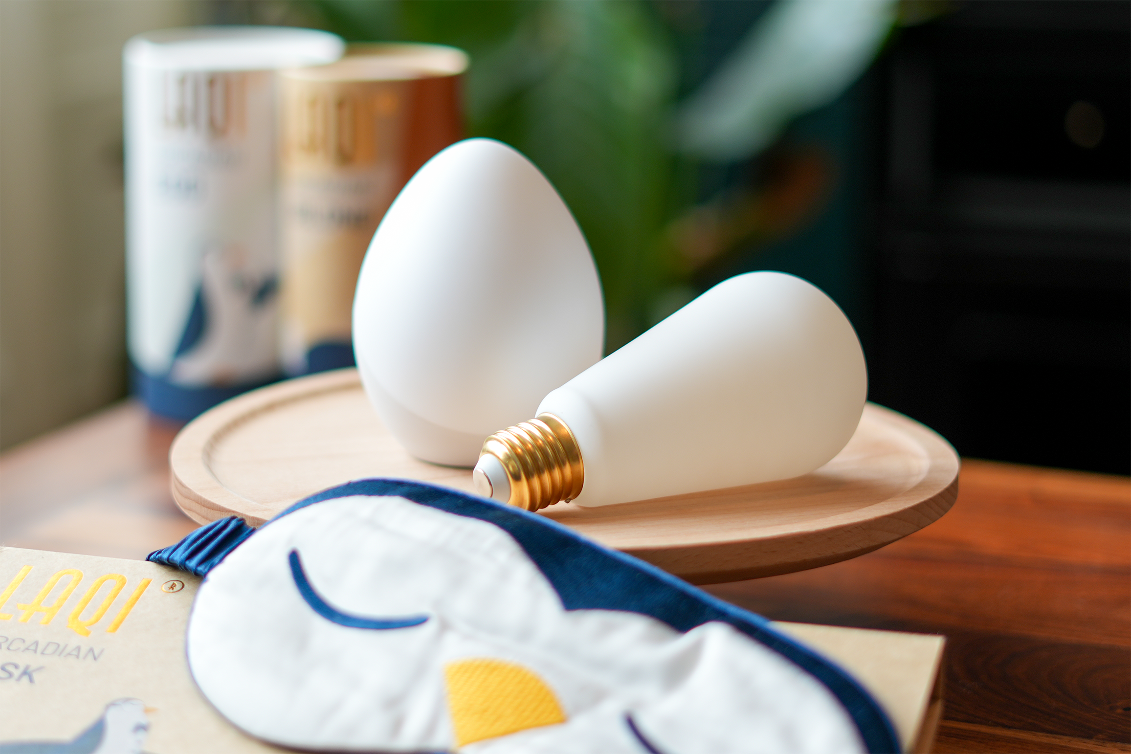
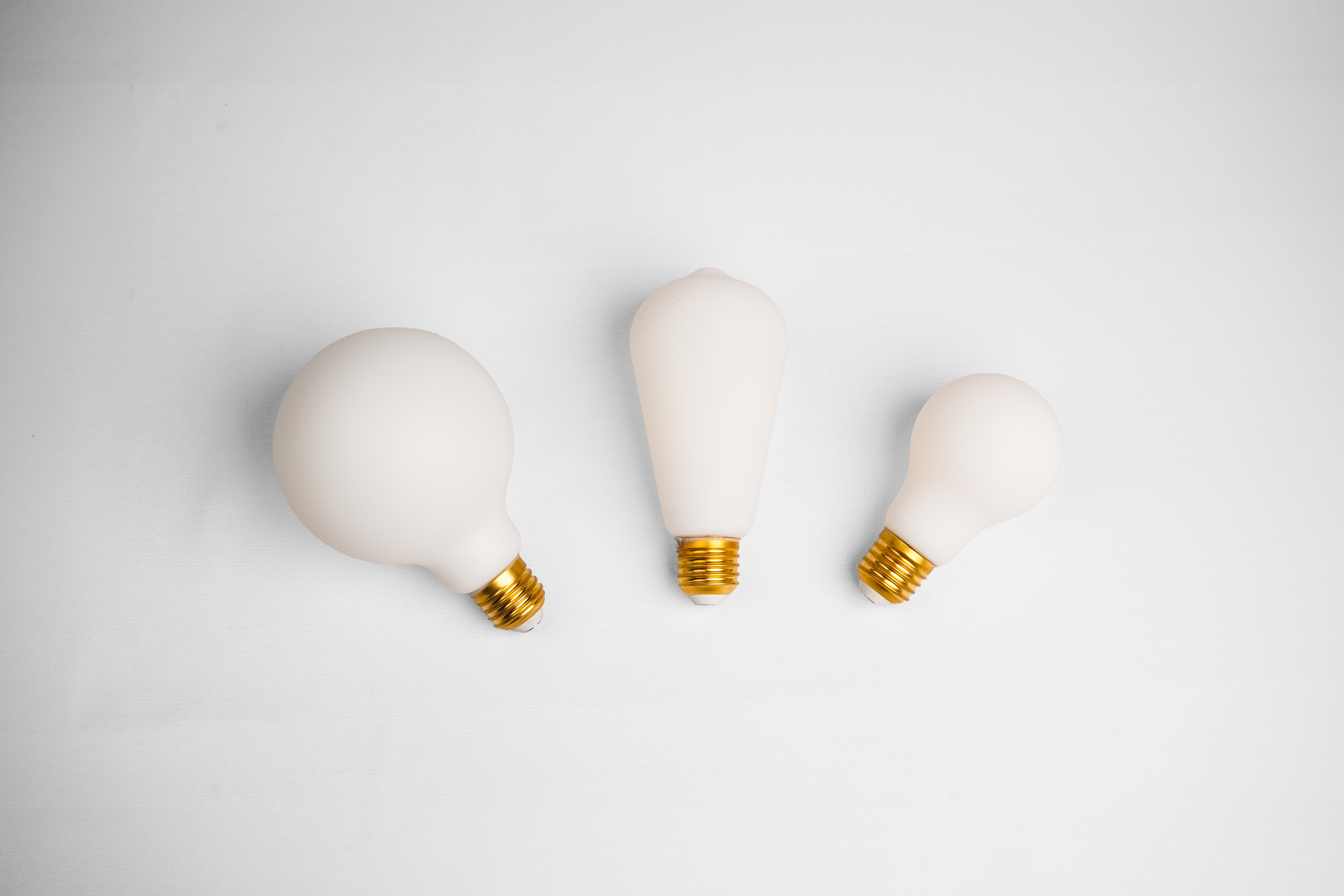
Laqi adaptive bulbs feature a high CRI, modulated light temperature, and adjustable intensity to suit your lifestyle. No need to choose between design and visual health: it's all integrated.
💡 Discover the Laqi Starter Kits
💬 FAQ
Does a high CRI consume more energy?
Not necessarily. It's not related to power consumption but to the quality of the LEDs and the spectrum they cover.
How do I know if the IRC is good?
Look for a "CRI > 90" rating. If it also says R9, that's even better.
Is it worth it for a room?
Yes, especially for reading or relaxing. A faithful light creates a more soothing atmosphere.
A faithful color is a sincere light.
Don't let your light betray your colors. Adopt respectful, comfortable, and aesthetic lighting with Laqi solutions.


